👨🏼💻 Work Project
👨🏼💻 Work Project
👨🏼💻 Work Project
Improving Nove25's e-commerce product details page
Improving Nove25's e-commerce product details page
Improving Nove25's e-commerce product details page
Improving Nove25's e-commerce product details page
See live website
Client
Nove25
Role
UI/UX Designer
Tools
Figma
Notion
Adobe Creative Cloud
Contentsquare
Typeform
Industry
E-commerce platform
Year
2022
Team
UX Designer
Product Manager
Front & End developer
Company Overview
Company Overview
Company Overview
Nove25 is an Italian jewelry brand with 18 European stores and a custom e-commerce platform. The entire platform was developed in-house using Prestashop, Elementor, and custom code.
Nove25 is an Italian jewelry brand with 18 European stores and a custom e-commerce platform. The entire platform was developed in-house using Prestashop, Elementor, and custom code.
Nove25 is an Italian jewelry brand with 18 European stores and a custom e-commerce platform. The entire platform was developed in-house using Prestashop, Elementor, and custom code.
⚠️ Problem Statement
⚠️ Problem Statement
⚠️ Problem Statement
How might we display Nove25's product offerings to increase customer understanding and conversion rates?
How might we display Nove25's product offerings to increase customer understanding and conversion rates?
How might we display Nove25's product offerings to increase customer understanding and conversion rates?
Metrics from Feb 2022 to Mar 2022
Metrics from Feb 2022 to Mar 2022
Conversion rate:
Conversion rate:
Conversion rate:
+21 %
+21 %
+21 %
Organic
Organic
Organic
Conversion rate:
Conversion rate:
Conversion rate:
+18 %
+18 %
+18 %
Paid Traffic
Paid Traffic
Paid Traffic
Total revenue:
Total revenue:
Total revenue:
€3.5K
€3.5K
€3.5K
€2.3K
€2.3K
€2.3K
Loading time:
Loading time:
Loading time:
-14.9 %
-14.9 %
-14.9 %
Solution Overview
Solution Overview
Solution Overview
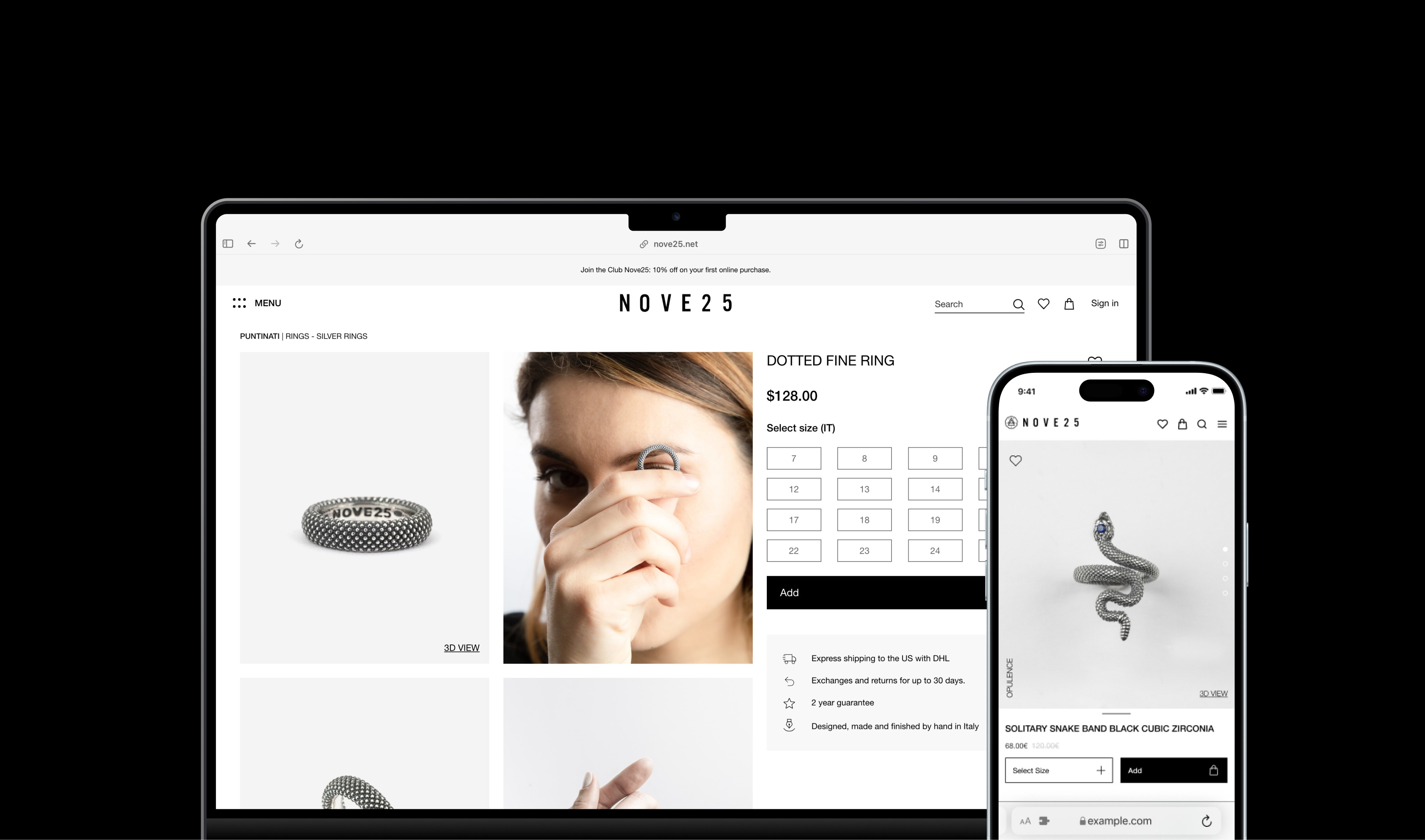
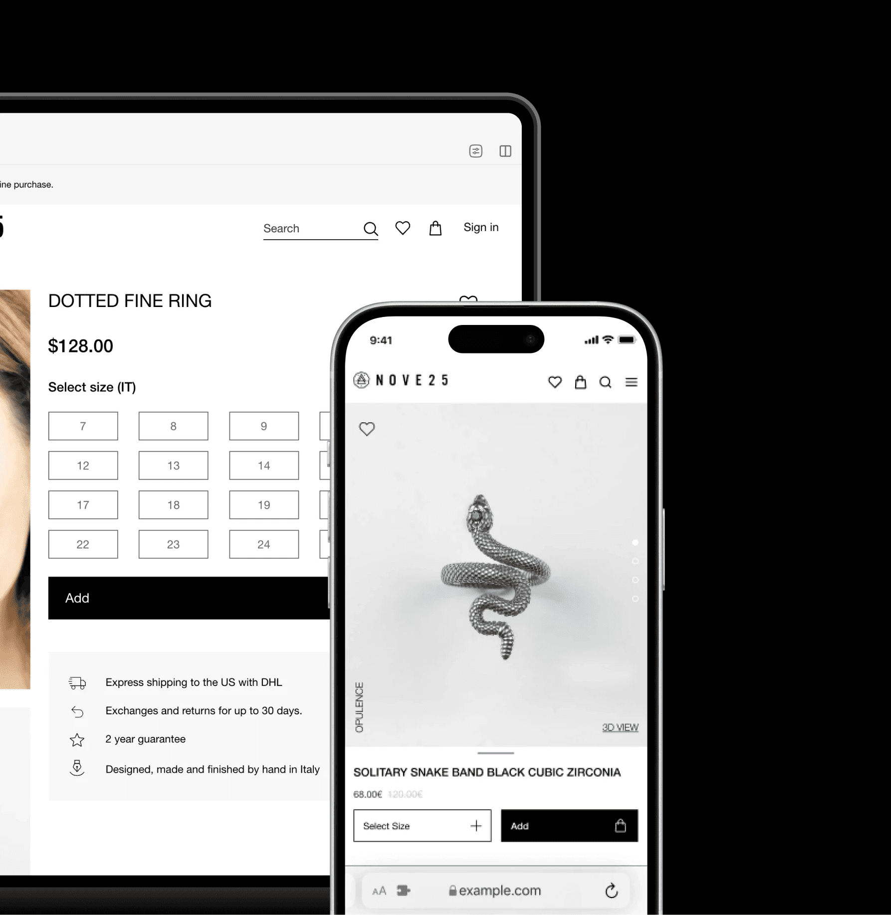
Sticky CTAs & size selection
Sticky CTAs & size selection
Sticky CTAs & size selection
By fixing the size selection and add to cart CTAs to the screen, users always have access to available sizes and are able to complete purchases more easily.
By fixing the size selection and add to cart CTAs to the screen, users always have access to available sizes and are able to complete purchases more easily.
By fixing the size selection and add to cart CTAs to the screen, users always have access to available sizes and are able to complete purchases more easily.
Improved product details
Improved product details
Improved product details
A redesigned hierarchy highlights key product details while also showcasing services such as returns and maintenance, giving users peace of mind before making purchases.
A redesigned hierarchy highlights key product details while also showcasing services such as returns and maintenance, giving users peace of mind before making purchases.
A redesigned hierarchy highlights key product details while also showcasing services such as returns and maintenance, giving users peace of mind before making purchases.
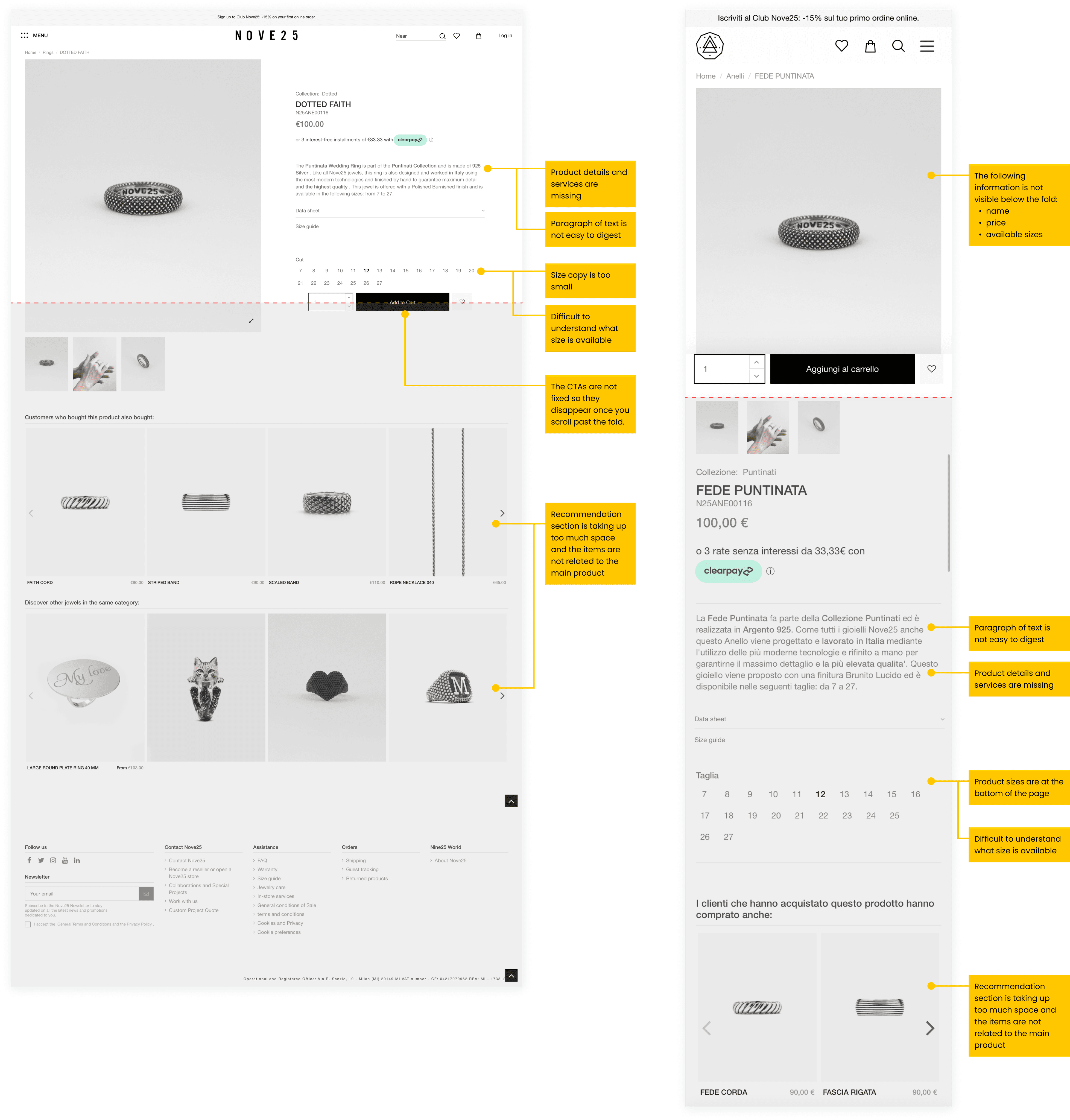
Site audit
Site audit
Site audit
Analyzing our product details page to find opportunities to improve
Analyzing our product details page to find opportunities to improve
Analyzing our product details page to find opportunities to improve
In order to understand how I might help the team achieve its goals, I decided to do a first-site audit analysis in order to learn the main pain points of the actual website. I was able to get multiple insights not just from what I could see but also I wanted to ask for feedback also to my team to have a different perspective.
In order to understand how I might help the team achieve its goals, I decided to do a first-site audit analysis in order to learn the main pain points of the actual website. I was able to get multiple insights not just from what I could see but also I wanted to ask for feedback also to my team to have a different perspective.
In order to understand how I might help the team achieve its goals, I decided to do a first-site audit analysis in order to learn the main pain points of the actual website. I was able to get multiple insights not just from what I could see but also I wanted to ask for feedback also to my team to have a different perspective.
Size selection
Size selection
Size selection
It's hard to understand what sizes are available. In mobile, the size section is not visible above the fold.
It's hard to understand what sizes are available. In mobile, the size section is not visible above the fold.
It's hard to understand what sizes are available. In mobile, the size section is not visible above the fold.
It's hard to understand what sizes are available. In mobile, the size section is not visible above the fold.
Photo Gallery
Photo Gallery
Photo Gallery
The layout of the photo gallery makes it hard for the user to browse the product quickly.
The layout of the photo gallery makes it hard for the user to browse the product quickly.
The layout of the photo gallery makes it hard for the user to browse the product quickly.
The layout of the photo gallery makes it hard for the user to browse the product quickly.
CTAs
CTAs
CTAs
Too many CTAs are grouped together and as the user scrolls, the CTAs disappear, forcing the user to scroll back to the top to make a purchase.
Too many CTAs are grouped together and as the user scrolls, the CTAs disappear, forcing the user to scroll back to the top to make a purchase.
Too many CTAs are grouped together and as the user scrolls, the CTAs disappear, forcing the user to scroll back to the top to make a purchase.
Too many CTAs are grouped together and as the user scrolls, the CTAs disappear, forcing the user to scroll back to the top to make a purchase.
Review/Services
Review/Services
Review/Services
The overall page lacks product details information, such as shipping, returns and maintenance, which help the user evaluate whether or not to purchase the product.
The overall page lacks product details information, such as shipping, returns and maintenance, which help the user evaluate whether or not to purchase the product.
The overall page lacks product details information, such as shipping, returns and maintenance, which help the user evaluate whether or not to purchase the product.
The overall page lacks product details information, such as shipping, returns and maintenance, which help the user evaluate whether or not to purchase the product.
Competitors Analysis
Competitors Analysis
Competitors Analysis
How do other companies structure their product details page?
How do other companies structure their product details page?
How do other companies structure their product details page?
I decided to analyze product detail pages from different industries and e-commerce sites to learn how they manage information and what type of information they are sharing.
I decided to analyze product detail pages from different industries and e-commerce sites to learn how they manage information and what type of information they are sharing.
I decided to analyze product detail pages from different industries and e-commerce sites to learn how they manage information and what type of information they are sharing.
Area of improvment
Area of improvment
Area of improvment
Lacking key product information
Lacking key product information
Lacking key product information
In comparison, the Nove25 page is missing key information that most competitors are including, such as available sizes, services and reviews, which are valuable to the user in the purchasing decision process.
In comparison, the Nove25 page is missing key information that most competitors are including, such as available sizes, services and reviews, which are valuable to the user in the purchasing decision process.
In comparison, the Nove25 page is missing key information that most competitors are including, such as available sizes, services and reviews, which are valuable to the user in the purchasing decision process.
In comparison, the Nove25 page is missing key information that most competitors are including, such as available sizes, services and reviews, which are valuable to the user in the purchasing decision process.
Size selection and add to cart
Size selection and add to cart
Size selection and add to cart
The size selection and principal CTAs are not grouped together, like on other competitor pages, leading to confusion for users as to where to select sizes and how to add their size to cart.
The size selection and principal CTAs are not grouped together, like on other competitor pages, leading to confusion for users as to where to select sizes and how to add their size to cart.
The size selection and principal CTAs are not grouped together, like on other competitor pages, leading to confusion for users as to where to select sizes and how to add their size to cart.
The size selection and principal CTAs are not grouped together, like on other competitor pages, leading to confusion for users as to where to select sizes and how to add their size to cart.
Connect the product to brand
Connect the product to brand
Connect the product to brand
Unlike its competitors, Nove25 isn't highlighting the stories behind the products and the brand. Explaining how each piece is crafted in Italy and the story behind Nove25 adds value to the products and builds awareness and affinity to the brand.
Unlike its competitors, Nove25 isn't highlighting the stories behind the products and the brand. Explaining how each piece is crafted in Italy and the story behind Nove25 adds value to the products and builds awareness and affinity to the brand.
Unlike its competitors, Nove25 isn't highlighting the stories behind the products and the brand. Explaining how each piece is crafted in Italy and the story behind Nove25 adds value to the products and builds awareness and affinity to the brand.
Unlike its competitors, Nove25 isn't highlighting the stories behind the products and the brand. Explaining how each piece is crafted in Italy and the story behind Nove25 adds value to the products and builds awareness and affinity to the brand.
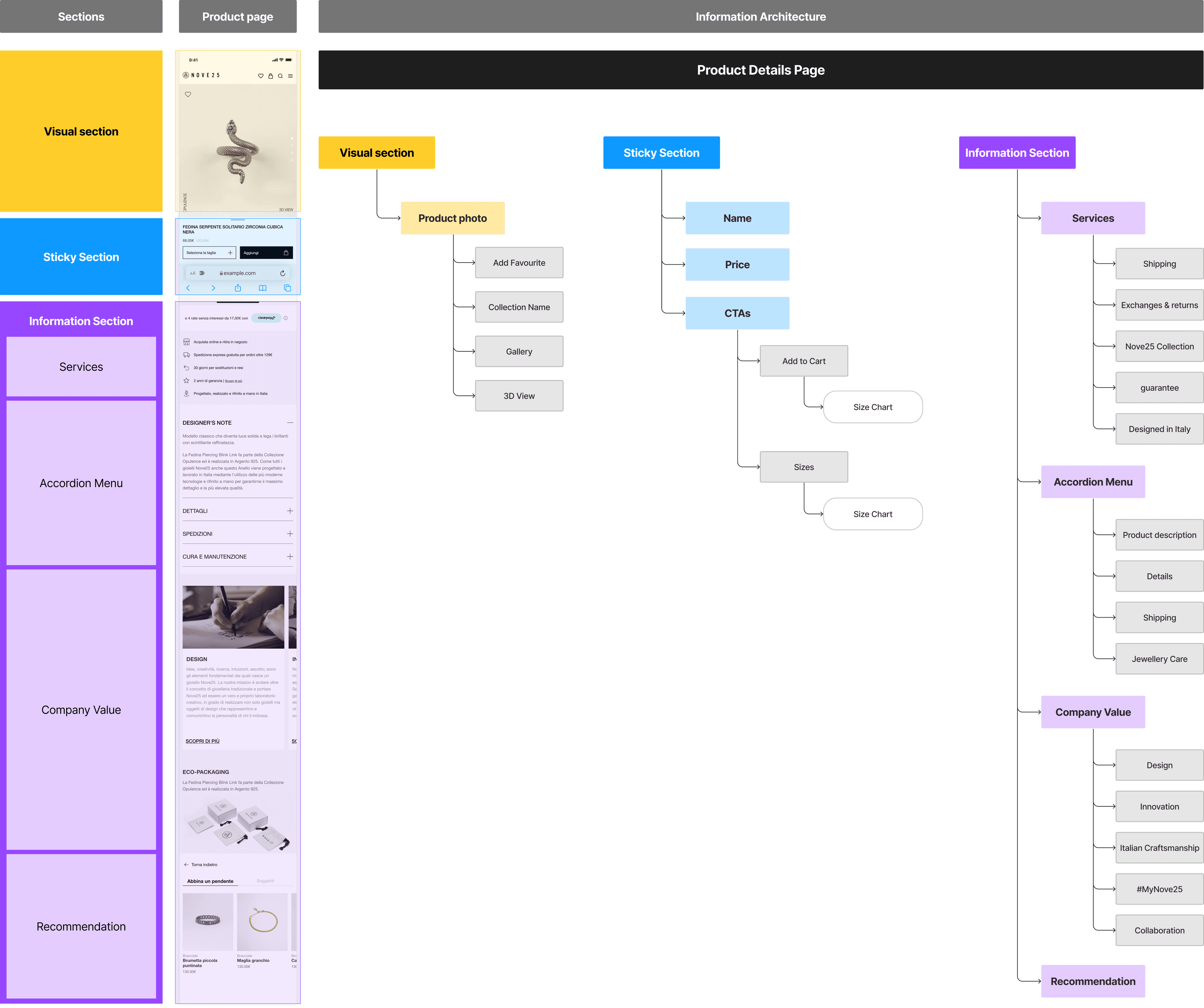
Information Architecture
Information Architecture
Information Architecture
How could we merge all the insights onto our product details page?
How could we merge all the insights onto our product details page?
How could we merge all the insights onto our product details page?
To understand how to merge and meet the client's needs, I created an information architecture to layout the hierarchy of the page. I brainstormed together with the design and marketing team to gather their input.
To understand how to merge and meet the client's needs, I created an information architecture to layout the hierarchy of the page. I brainstormed together with the design and marketing team to gather their input.
To understand how to merge and meet the client's needs, I created an information architecture to layout the hierarchy of the page. I brainstormed together with the design and marketing team to gather their input.
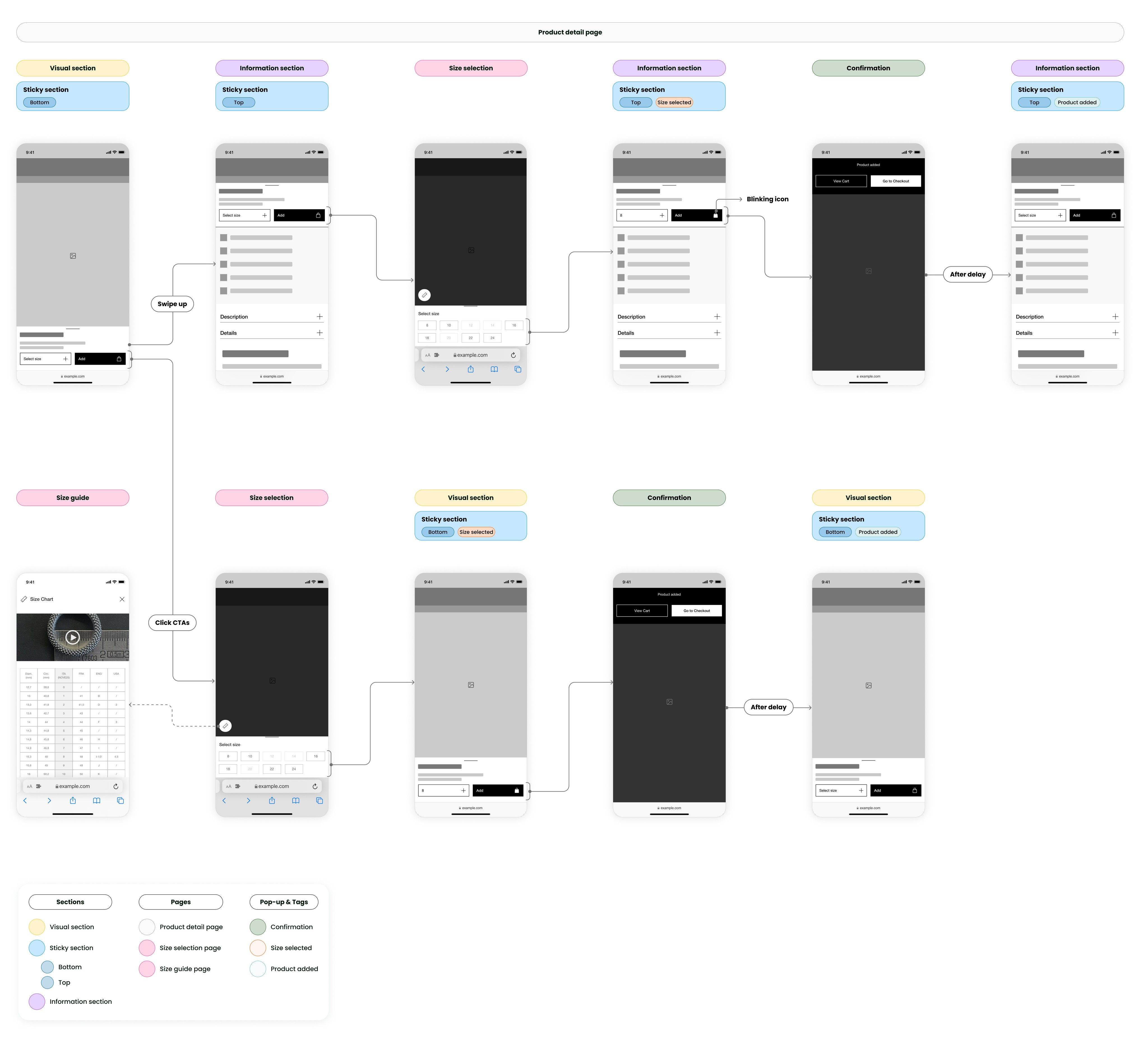
Wireflow
Wireflow
Wireflow
Designing the purchase consideration flow
Designing the purchase consideration flow
Designing the purchase consideration flow
After conducting a competitor analysis and creating a new information architecture, I began designing layouts for the new product details page and creating user flows for the product consideration and purchase journey.
After conducting a competitor analysis and creating a new information architecture, I began designing layouts for the new product details page and creating user flows for the product consideration and purchase journey.
After conducting a competitor analysis and creating a new information architecture, I began designing layouts for the new product details page and creating user flows for the product consideration and purchase journey.
User testing
User testing
User testing
Adjusting my design based on user feedback
Adjusting my design based on user feedback
Adjusting my design based on user feedback
Throughout prototyping, I tested my designs with 15 participants, checking for understandability, ease of use and navigation. I specifically evaluated the ease of adding products to the cart, finding specific product information, and product size selection.
Throughout prototyping, I tested my designs with 15 participants, checking for understandability, ease of use and navigation. I specifically evaluated the ease of adding products to the cart, finding specific product information, and product size selection.
Throughout prototyping, I tested my designs with 15 participants, checking for understandability, ease of use and navigation. I specifically evaluated the ease of adding products to the cart, finding specific product information, and product size selection.
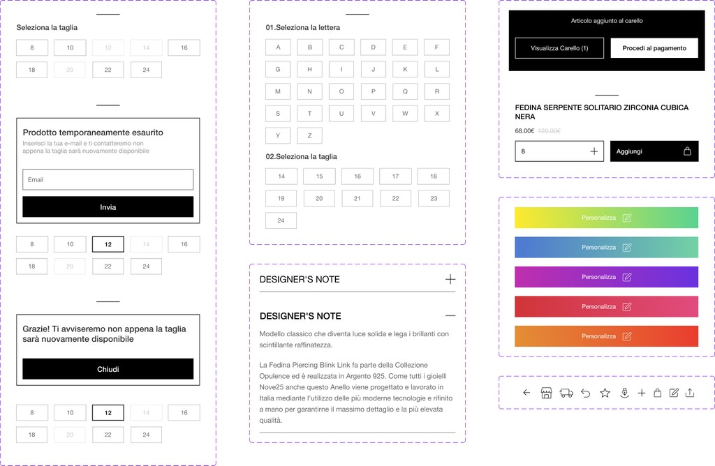
Showing users how to measure their size
Showing users how to measure their size
Showing users how to measure their size
Some users found it hard to understand how they should measure sizes so I decided to add a short video to guide the user in understanding how to measure their size.
Some users found it hard to understand how they should measure sizes so I decided to add a short video to guide the user in understanding how to measure their size.
Some users found it hard to understand how they should measure sizes so I decided to add a short video to guide the user in understanding how to measure their size.
Some users found it hard to understand how they should measure sizes so I decided to add a short video to guide the user in understanding how to measure their size.
Making size selection more obvious
Making size selection more obvious
Making size selection more obvious
Some users had difficulty distinguishing between selected, unavailable, and non-selected sizes so I increased the contrast between the different states through opacity and weight of the typeface.
Some users had difficulty distinguishing between selected, unavailable, and non-selected sizes so I increased the contrast between the different states through opacity and weight of the typeface.
Some users had difficulty distinguishing between selected, unavailable, and non-selected sizes so I increased the contrast between the different states through opacity and weight of the typeface.
Some users had difficulty distinguishing between selected, unavailable, and non-selected sizes so I increased the contrast between the different states through opacity and weight of the typeface.
3D view layout
3D view layout
3D view layout
Some users found it frustrating to leave the product detail page when viewing the 3D mockup, as it navigating back to purchase harder. To fix this, I worked with developers to embed the 3D view in an in-page overlay so users weren't directed to a new page.
Some users found it frustrating to leave the product detail page when viewing the 3D mockup, as it navigating back to purchase harder. To fix this, I worked with developers to embed the 3D view in an in-page overlay so users weren't directed to a new page.
Some users found it frustrating to leave the product detail page when viewing the 3D mockup, as it navigating back to purchase harder. To fix this, I worked with developers to embed the 3D view in an in-page overlay so users weren't directed to a new page.
Some users found it frustrating to leave the product detail page when viewing the 3D mockup, as it navigating back to purchase harder. To fix this, I worked with developers to embed the 3D view in an in-page overlay so users weren't directed to a new page.
Figma Components
Figma Components
Figma Components
Building the style guide
Building the style guide
Building the style guide
After I finalized the visual direction that I wanted to pursue, I began constructing the high-fidelity mockup alongside developing developer-ready components in Figma. Codifying elements into components helped to optimize my workflow, reduce the completion time for the project and ensure a smooth developer handoff.
After I finalized the visual direction that I wanted to pursue, I began constructing the high-fidelity mockup alongside developing developer-ready components in Figma. Codifying elements into components helped to optimize my workflow, reduce the completion time for the project and ensure a smooth developer handoff.
After I finalized the visual direction that I wanted to pursue, I began constructing the high-fidelity mockup alongside developing developer-ready components in Figma. Codifying elements into components helped to optimize my workflow, reduce the completion time for the project and ensure a smooth developer handoff.
Final Design
Final Design
Final Design